My Role
This was one of the first UX design projects I participated in. This experience made me realize how important to design based on user needs and constraints instead of on the designer's own assumptions.
At the beginning, we set our goal as to help people with low vision live their lives better and assumed their biggest needs was to see and read. But after interviewing patients with low vision, we realized there was a gap to fill their emotional needs.
There are tradeoffs in design and we should choose the design priority based on user's priority. We spent a great amount of time talking with low vision patients and their doctors to understand their physical and emotional needs. Then we designed the mobile application from wireframes to interactive prototypes and conducted usability testing on the prototype.

The challenge
Understand the Emotional Needs
Low vision is a type of visually impaired that cannot be fully corrected with medical treatment, surgery, or conventional glasses. The primarily affected group is the elder people.Seriously impeded from performing daily tasks especially reading, low vision patients feel isolated and losing connection to the world.

Contextual Inquiry
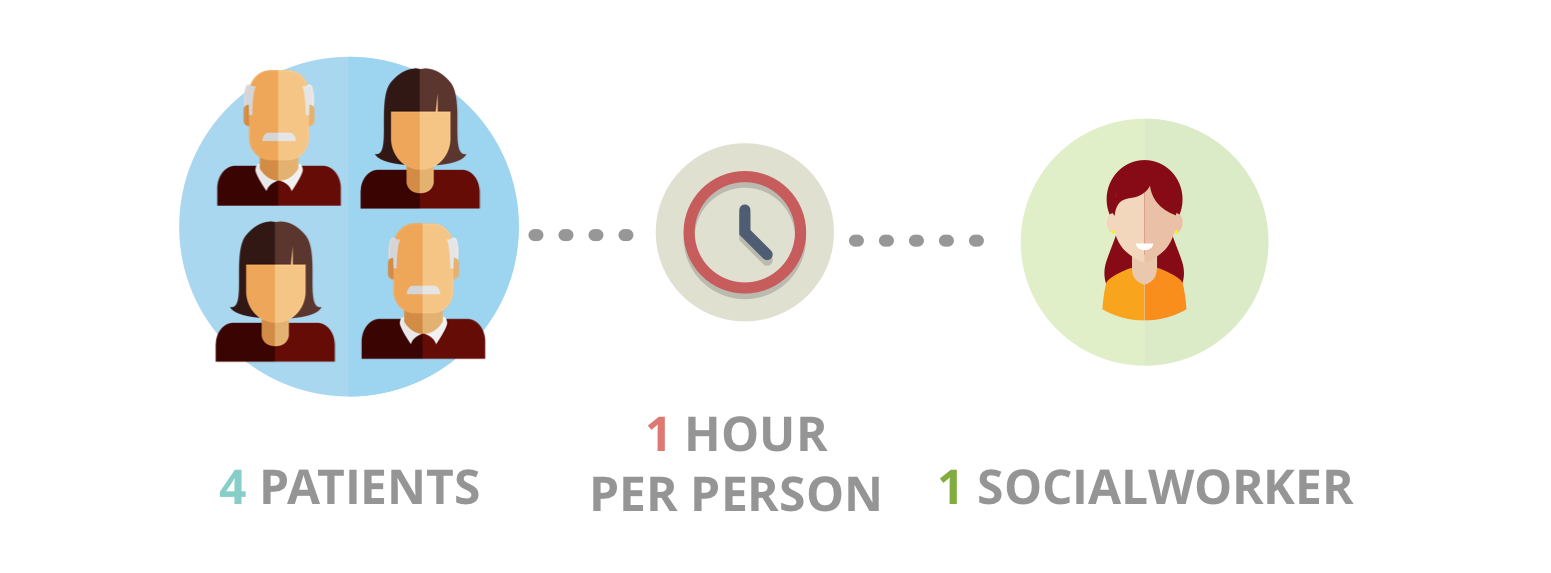
We conducted interviews with 4 low vision patients and 1 social worker who volunteers to assist the low vision group at Kellogg Eye Center. We also observed how our target user complete daily activities. We identified that people with low vision have two common needs:
Reading Experience
The most mentioned problem is reading. When their vision starts to deteriorate, the first primary activity affected is reading. In addition, other reading-related activities, such as watching TV and driving vehicles, are also mentioned.
Social Engagement
People with low vision often feel frustrated when they fail to perform simple tasks. Most of these elder patients live independently and far away from their children. They have strong emotional and social needs.

Brainstorm and Parallel Design
To maximize solution diversity, we implemented the parallel design.
Design 1: A virtual reality app that works with Google Cardboard.
Design 2: A mobile app with an attachable stand.
Design 3: A hand-held smartphone case that turns the smartphone into an electronic magnifier.A mobile application provides huge flexibility.
There are several existing hardware on a smartphone, such as flash light and audio jack, so further functions can be developed without additional costs. So Design 2 was kept as the base of our final design.

Some Concepts
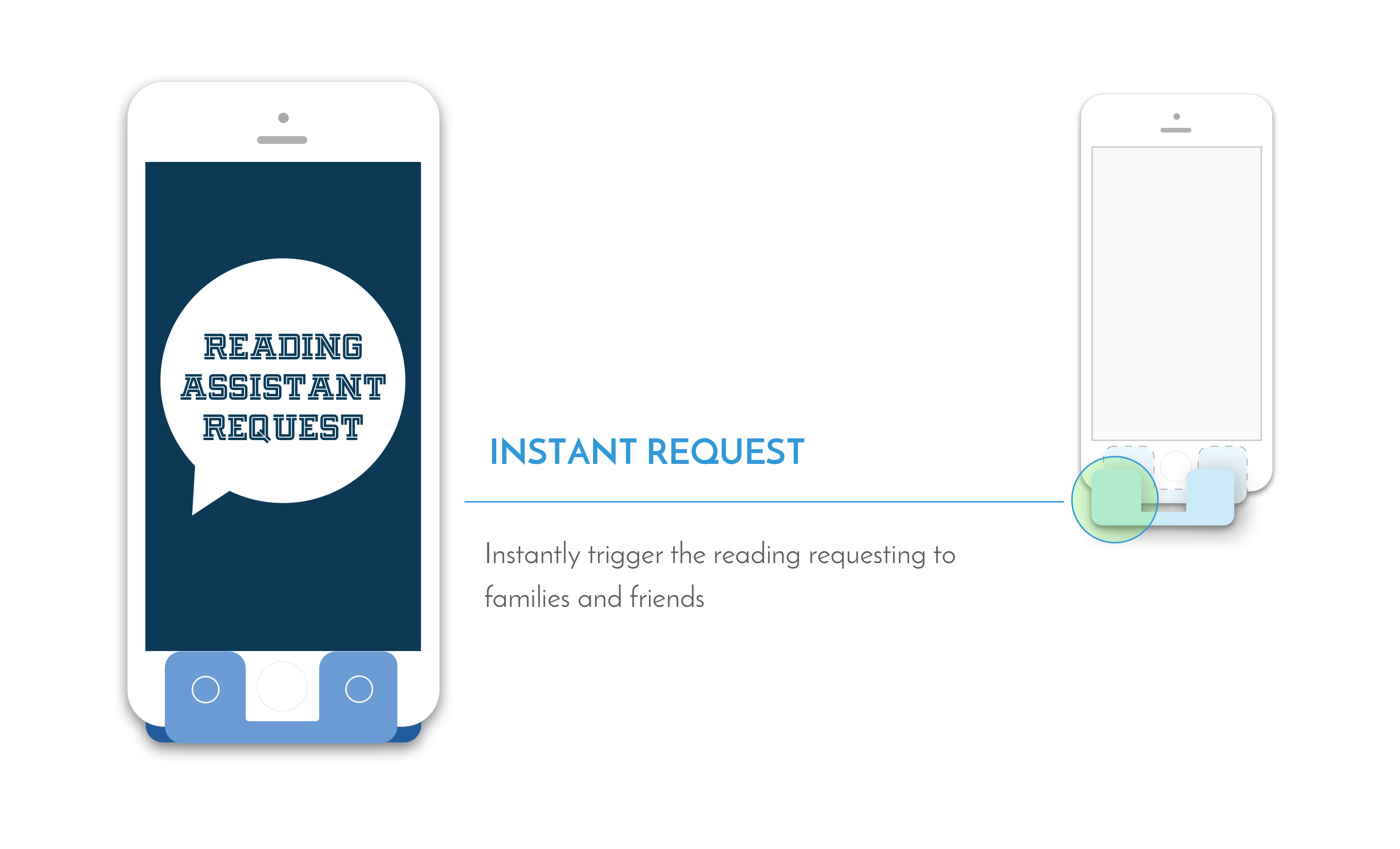
Readful-U is a mobile application with an attachable stand that helps people with low vision to read easily. It has 2 function units: the general function unit and the "Read for you" social reading unit, which not only assists low vision people to read, but also let them feel the support and warmth from families and friends.
Mobile Application
Mobile application provides effective reading assist, integrated with social interaction activities.

Attachable Stand
Attachable Stand with Hot Keys provides stable and smooth reading experience. Physical buttons are easier to find.

Wireframe and Low-fi Prototypes
After narrowing down solutions, we sketched out the workflow of the general function unit based on which the social reading function was proposed. We used paper to draw the wireframe and low-fidelity prototype. We tested the prototype with users. Based on our learning from the usability test, we made many modifications between low-fi and high-fi prototypes.

Usability Test
During the usability tests, the users indicated that we should prioritize visibility of elements much higher than aesthetics. Through using enlarged buttons and simple high-contrast colors, the elements on the user interface are presented in the best way to help users locate them. They also found that, by using the stand, their hands were freed and necks relaxed. They felt less tired and could read for a longer time.They told us that the physical buttons on the stand are easier to locate than virtual buttons because when the stand was attached, functions were easier to access.